Watercolor patterns:
I finally took the time to teach myself how to create watercolor patterns in Illustrator using hand painted illustrations. Until now I had been creating designs directly into Adobe Illustrator, and making repeat patterns out of them. I had my doubts about how well Illustrator would render the watercolor into vectors, but I think it looks really nice. Above on the left is a eucalyptus leaf pattern, and on the right a hypericum berry pattern.
This is not by any means an in-depth explanation of how to create a pattern in Illustrator. But if you have a little experience with AI, this will give you an idea of the steps involved.
First I painted my designs with watercolor (above), then scanned them into Photoshop, where I cleaned them up to make them look sharper and more vibrant. I then transferred them into Adobe Illustrator, and used Image Trace to turn the designs into vectors. The High Fidelity Photo setting in the Image Trace drop down menu seemed to render the color variations most closely. The final stage to transform your images into vectors is to hit Expand. At this point, I would suggest ungrouping all of the elements (Object -> Ungroup), and then selecting each element and grouping all of its parts (Object -> Group). This will enable you to move each element separately and easily. But if you forget to "regroup" all the parts of each element, you'll be running into a lot of problems!
The fun part is then rearranging everything to create an aesthetically pleasing pattern. The best way to make a design interesting to the eye is to vary the orientation and size of each leaf, berry or element you're using. I initially painted most of the berries and leaves with the same size and orientation, and then easily modified them in Illustrator.
To make a pattern, you start by designing a square tile, which will then be repeated over and over to create the pattern. In order to make a seamless pattern, it's important to place some of the elements (leaves, berries, etc.) on the edges of your tile, as shown in the picture below, left. This overlap helps the eye move across the pattern without a break. Without the overlap, the tile will appear very obvious in the pattern (as shown below, center)--which may be appropriate at times, but not always. Note the difference in the pattern with the overlapping designs (below, right).
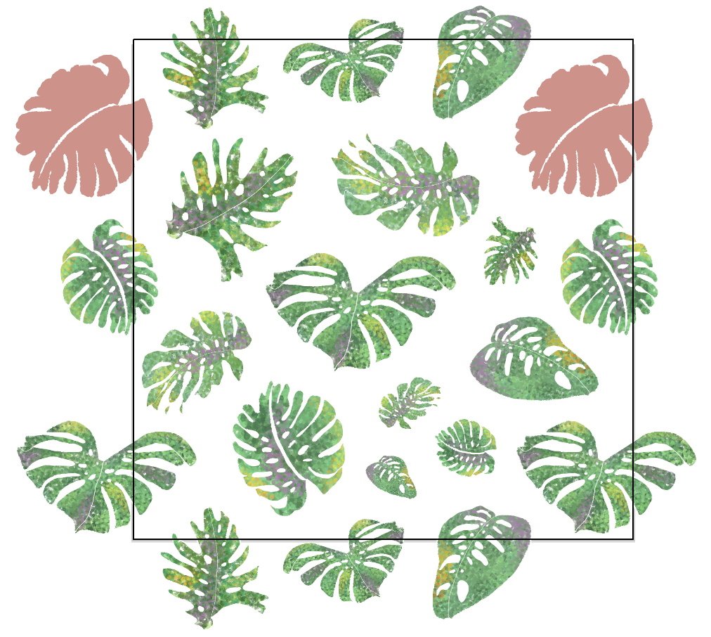
To create this overlap, start with the edges--you can fill the center of the tile later. Place an element somewhere on the edge: now you have to make sure that the opposite edge also features the same element in the exact same position. I tried to show this in the following screen capture, by highlighting pairs of elements in the same color:
To do this, select the element, then move a copy of it to the opposite edge (Object -> Transform -> Move). You will get a dialog box that looks like this one:
Let's imagine you started with a 5" x 5" document. If you are copying en element to the opposite side horizontally from left to right (as in the pink highlighted example above), change Horizontal to 5, Vertical to 0, then click Copy. If you are copying an element to the opposite side vertically from top to bottom, change Horizontal to 0, Vertical to 5, then click Copy. The only trick here is that the vertical axis is the reverse of what maths usually teach us: copying an element vertically from bottom to top, you will have to change Vertical to - (minus) 5.
Once you've placed all of your elements around the edges of the tile, the last step to complete your tile is to fill the inside.
Finally, to define the area that is to be repeated, the trick is to create a square that is exactly the same size as your tile, with no fill and no stroke (or outline), and to place it exactly on top of your tile. You can do this with the Rectangle Tool, holding the Shift key. Send this "invisible" square to the back (Object -> Arrange -> Send to Back). Then select the whole thing with the Selection Tool (including the elements hanging over the edges), and drag it to the Swatches.
You're now ready to test your pattern! Draw a new bigger square on the same artboard, next to your tile, with no stroke. And then fill it with the tile you've saved in Swatches. At this point, you may notice that some areas need to be filled, or that some elements are too close to each other. You can go back and modify your tile using the same steps, and then test it again once you've saved the new tile in Swatches.


